In the last two posts (here and here) I’ve been talking about how process mapping is a valuable set of techniques to create a visual representation of the processes within an organization. Fundamental tools, every quality professional should be fluent in them.
The next level of maturity is process modeling which involves creating a digital representation of a process that can be analyzed, simulated, and optimized. Way more comprehensive, and frankly, very very hard to do and maintain.
Process Map
Process Model
Why is this Important?
Notation ambiguous
Standardized notation convention
Standardized notation conventions for process modeling, such as Business Process Model and Notation (BPMN), drive clarity, consistency, communication and process improvements.
Precision usually lacking
As precise as needed
Precision drives model accuracy and effectiveness. Too often process maps are all over the place.
Icons (representing process components made up or loosely defined
Icons are objectively defined and standardized
The use of common modeling conventions ensures that all process creators represent models consistently, regardless of who in the organization created them.
Relationship of icons portrayed visually
Icon relationships definite and explained in annotations, process model glossary, and process narratives
Reducing ambiguity, improving standardization and easing knowledge transfer are the whole goal here. And frankly, the average process map can fall really short.
Limited to portrayal of simple ideas
Can depict appropriate complexity
We need to strive to represent complex workflows in a visually comprehensible manner, striking a balance between detail and clarity. The ability to have scalable detail cannot be undersold.
One-time snapshot
Can grow, evolve, mature
How many times have you sat down to a project and started fresh with a process map? Enough said.
May be created with simple drawing tools
Created with a tool appropriate to the need
The right tool for the right job
Difficult to use for the simplest manual simulations
May provide manual or automated process simulation
In w world of more and more automation, being able to do a good process simulation is critical.
Difficult to link with related diagram or map
Vertical and horizontal linking, showing relationships among processes and different process levels
Processes don’t stand along, they are interconnected in a variety of ways. Being able to move up and down in detail and across the process family is great for diagnosing problems.
Uses simple file storage with no inherent relationships
Uses a repository of related models within a BPM system
It is fairly common to do process maps and keep them separate, maybe in an SOP, but more often in a dozen different, unconnected places, making it difficult to put your hands on it. Process modeling maturity moves us towards a library approach, with drives knowledge management.
Appropriate for quick capture of ideas
Appropriate for any level of process capture, analysis and design
Processes are living and breathing, our tools should take that into account.
This is all about moving to a process repository and away from a document mindset. I think it is a great shame that the eQMS players don’t consider this part of their core mission. This is because most quality units don’t see this as part of their core mission. We as quality leaders should be seeing process management as critical for future success. This is all about profound knowledge and utilizing it to drive true improvements.
A process flow diagram is a visual representation of the steps in a process, showing the sequence of activities from start to finish. Using simple shapes and arrows, it maps out how work flows through your system, highlighting decision points, inputs, outputs, and the relationships between different steps. When most people think process map they really mean process flow.
When to Use Process Flow Diagrams
Process flow diagrams shine in various scenarios:
Analyzing existing processes: They help identify inefficiencies, bottlenecks, and redundancies in current workflows.
Designing new processes: When creating new procedures, flow diagrams provide a clear blueprint for implementation.
Training and onboarding: They serve as excellent visual aids for explaining processes to new team members.
Continuous improvement initiatives: Flow diagrams facilitate discussions about potential enhancements and streamlining opportunities.
Compliance and auditing: They offer a standardized way to document processes for regulatory purposes.
Creating Effective Process Flow Diagrams
To make the most of your diagrams:
Start with the big picture: Begin by outlining the major steps before diving into details.
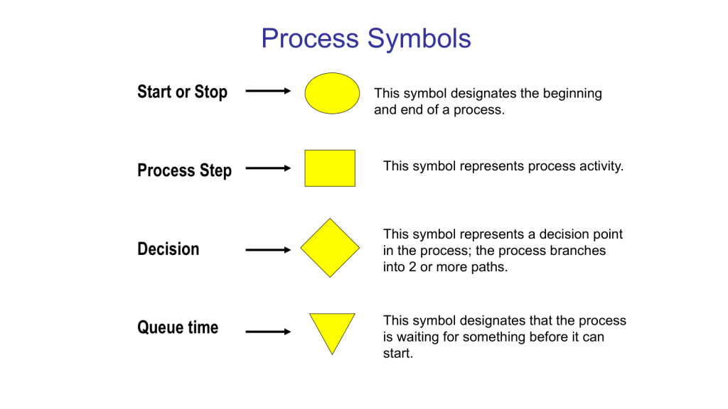
Use standard symbols: Stick to commonly recognized shapes (e.g., rectangles for activities, diamonds for decisions) to ensure clarity.
Keep it simple: Avoid cluttering your diagram with too much information. Focus on the key steps and decision points.
Involve the right people: Collaborate with those who actually perform the process to ensure accuracy.
Review and refine: Regularly update your diagrams as processes evolve.
Benefits of Using Process Flow Diagrams
Process flow diagrams are truly one of the core quality tools. With them we can:
Improve communication: They provide a common visual language for discussing processes across teams.
Enhance efficiency: By clearly mapping out steps, you can more easily identify areas for optimization.
Better decision-making: Flow diagrams help managers understand the implications of process changes.
Increase standardization: They promote consistency in how tasks are performed across the organization.
Process flow diagrams are more than just pretty pictures – they’re powerful tools for understanding, improving, and communicating about your business processes. By incorporating them into your workflow analysis and design efforts, you’ll be taking a significant step towards operational excellence.
This is the level of process mapping that usually sits at the heart of the SOP.
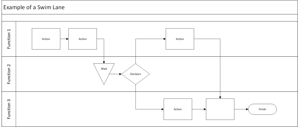
Swim-Lane Flowchart
A swim lane flowchart, also known as a swim lane diagram or cross-functional flowchart, is a visual representation of a process that separates activities into distinct lanes. Each lane typically represents a different department, team, or individual responsible for a set of actions within the process.
Key Benefits of Swim Lane Flowcharts
Clear Responsibility Assignment: By dividing the process into lanes, it’s immediately clear which team or individual is responsible for each step.
Improved Communication: These diagrams provide a common visual language for discussing processes across departments.
Identify Handoffs and Bottlenecks: Easily spot where work passes between teams and where delays might occur.
Process Optimization: Visualizing the entire process helps identify redundancies and opportunities for streamlining.
Onboarding and Training: New team members can quickly grasp complex processes and their role within them.
Creating an Effective Swim Lane Flowchart
To make the most of this tool:
Define the Process Scope: Clearly identify the start and end points of the process you’re mapping.
Identify Participants: Determine which departments or roles will have their own lanes.
Map the Process: Use standard flowchart symbols to represent steps, decisions, and document flows.
Show Handoffs: Clearly indicate where work passes from one lane to another.
Review and Refine: Collaborate with stakeholders to ensure accuracy and identify improvement opportunities.
Data Maps are an example of a swim lane flow chart.
Here’s a blog post on process flow with RACI matrix:
Mastering Process Management: Combining Process Flow with RACI Matrix
This tool merges two powerful tools stand out for their ability to clarify complex workflows: the process flow diagram and the RACI matrix. When combined, these tools create a comprehensive view of not just how a process unfolds, but also who’s involved at each step. Let’s dive into this dynamic duo and explore how they can revolutionize your process management.
Process Flow Diagram: This visual representation maps out the sequence of steps in a process, showing how work progresses from start to finish.
RACI Matrix: This responsibility assignment chart clarifies the roles people play in each process step:
Responsible: Who does the work?
Accountable: Who makes the final decisions?
Consulted: Who provides input?
Informed: Who needs to be kept in the loop?
When you combine a process flow with a RACI matrix, you create a comprehensive view of your process that answers two critical questions:
What happens in the process?
Who’s involved at each step?
This integration strives to provide clarity of roles. It becomes immediately clear who’s responsible for each step, reducing confusion and improving accountability. Team members can easily see where they fit into the larger process and who they need to interact with. This should hopefully help balance resources and streamline decision-making. It is a great tool for training.
Creating Your Integrated Diagram
To build your process flow with RACI matrix:
Start with Your Process Flow: Map out the steps of your process using standard flowchart symbols.
Add RACI Information: For each step, indicate the R, A, C, and I roles. This can be done through color-coding, symbols, or additional columns next to each step.
Review and Refine: Collaborate with stakeholders to ensure the diagram accurately reflects both the process and the roles involved.
Use It: Implement the diagram in your operations, referring to it for training, process improvement, and day-to-day management.
Integrating process flows with RACI matrices creates a powerful tool for process management. It not only shows how work gets done but also clarifies who’s involved every step of the way. This comprehensive view can lead to more efficient operations, clearer communication, and ultimately, better business outcomes.
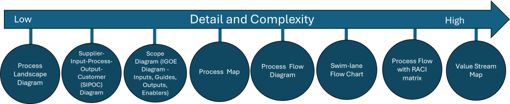
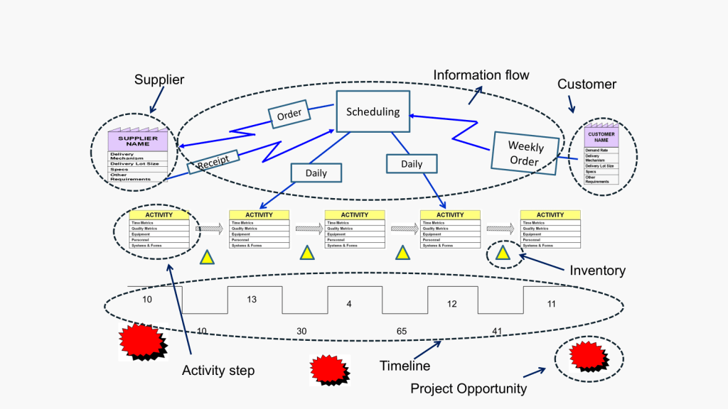
Value Stream Map
Value Stream Mapping (CSM) is a process mapping technique used to analyze, design, and manage the flow of materials and information required to bring a product or service to a customer. It is a visual representation of every step in your process, from the initial order to the final delivery of the product or service.
Coming out of Lean and organization excellence the value stream map is all about identifying waste: VSM helps you spot non-value-adding activities in your processes, allowing you to eliminate them and improve efficiency.
How to Create a Value Stream Map
Create a Current State Map: Document your process as it currently exists, including material and information flows.
Analyze the Current State: Identify areas of waste and inefficiency in your current process.
Design a Future State Map: Envision an improved process that eliminates the identified waste.
Implement Changes: Develop and execute a plan to move from the current state to the future state.
Review and Iterate: Continuously monitor your new process and make further improvements as needed.
Best Practices for Value Stream Mapping
Involve Cross-Functional Teams: Ensure representatives from all relevant departments participate in the mapping process.
Focus on the Customer: Always keep the end customer’s needs in mind when analyzing and improving your processes.
Use Standard Symbols: Adopt a consistent set of symbols to represent different elements of your value stream.
Walk the Process: Physically follow the flow of materials and information to gain a firsthand understanding of your processes.
Measure Key Metrics: Collect data on important metrics like cycle time, lead time, and inventory levels to quantify improvements.
I love a good process map in all it’s permutations. It is important to remember that the various process mapping tools are on a scale on order of detail and complexity.
Tool Name
Description
Process Landscape Diagram
A Process Landscape Diagram is a visual representation that outlines the structure and interdependencies of processes within an organization, providing insight into how these processes work together to achieve strategic goals. This tool helps in understanding process flows and managing business operations more effectively by illustrating connections and hierarchies among various processes.
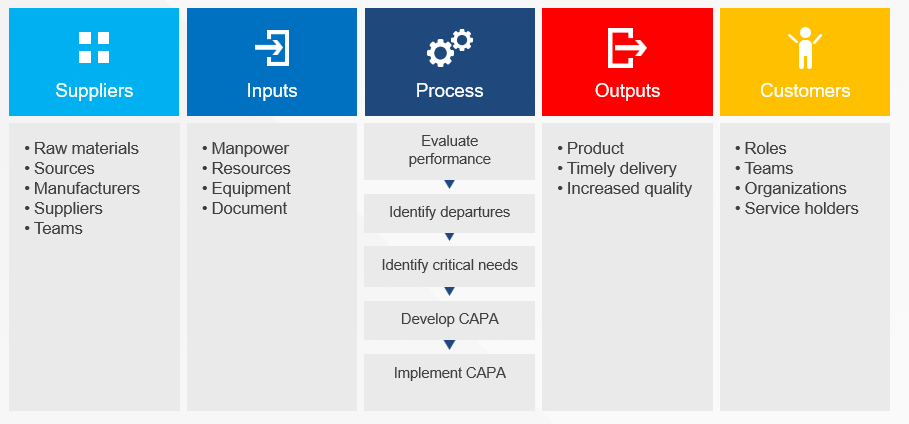
SIPOC
SIPOC is a visual representation tool for documenting a business process from beginning to end. It provides a high-level overview by summarizing the key components of Suppliers, Inputs, Processes, Outputs, and Customers.
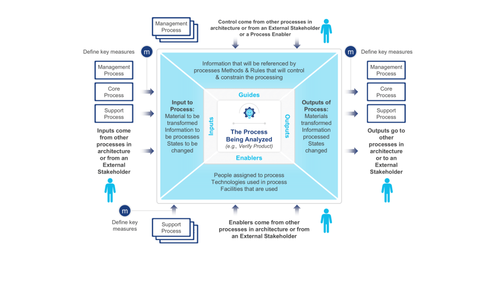
Scope Diagram (IGOE Diagram)
The Scope Diagram, also known as the IGOE Diagram, is used to define and agree on the boundaries of a process, enhancing communication among stakeholders. This diagram illustrates the scope of a project at a high abstraction level and helps identify candidate processes for change. It focuses on the Inputs, Guides, Outputs, and Enablers of a business process, facilitating better understanding and management of the scope by clarifying process boundaries without detailing internal system features.
Process Map
A Process Map is a visual tool used to represent the flow of work and the steps involved in a business process. This tool helps teams understand, analyze, and improve workflows by detailing the processes involved, making it easier to identify inefficiencies and areas for improvement. Process maps are often utilized in project management and continuous improvement efforts to enhance productivity and streamline operations.
Process Flow Diagram
A Process Flow Diagram (PFD) is a diagram commonly used to indicate the general flow of plant processes and equipment. It visualizes the sequential steps and relationships between components in a process, aiming to improve project planning and identify inefficiencies.
Swim-lane Flow Chart
A Swim-lane Flow Chart, also known as a cross-functional diagram, is a type of flowchart that shows the workflow and responsibilities in a process. It visually segments tasks into lanes that clarify who is responsible for each step, making it easier to understand complex processes and identify inefficiencies or redundancies.
Process Flow with RACI matrix
The RACI matrix is a project management tool that clarifies roles and responsibilities of team members by categorizing them into four groups: Responsible, Accountable, Consulted, and Informed. This structure aids in ensuring effective communication and workflow management across various stages of a project, helping teams stay aligned and avoiding confusion.
Process Mapping Tools
Process Landscape Diagram
A process landscape diagram is a high-level visual representation of an organization’s business processes and their relationships. Process landscape diagrams provide a comprehensive overview of an organization’s processes at a macro level and define the scope and relationships between an organization’s business processes. This serves as a simple way to handle process-related communication and serves as a starting point for detailed process discovery.
The process landscape diagram represents processes as ‘black-boxes’, focusing on interrelationships rather than internal details. Thus it shows the structure, grouping, modularity, functionality, and technology of chain processes, business processes, and working processes. Ideally this should include connections to external participants or stakeholders.
Components and Structure
A typical process landscape diagram may include:
Core processes (value chain or end-to-end processes)
Management processes
Support processes
Relationships and dependencies between processes
Connections to external participants or stakeholders
When to do
The process landscape diagram is design to enable organizations to maintain an overview of processes which makes this an excellent centerpiece to your Quality Manual.
ICH Q10 actually has a nice process landscape in it.
SIPOC diagrams are powerful tools in process improvement and management, offering numerous advantages that make them invaluable in various scenarios. These diagrams provide a high-level overview of a process, enabling teams to grasp the big picture quickly and efficiently. By facilitating clear communication and collaboration among team members and stakeholders, SIPOC diagrams help break down silos and foster a shared understanding of complex processes. This clarity often leads to the identification of improvement opportunities and potential problem areas that might otherwise go unnoticed.
One of the key strengths of SIPOC diagrams lies in their versatility. They serve as excellent tools for defining and scoping complex projects, helping teams to set clear boundaries and objectives from the outset. Additionally, these diagrams aid in understanding customer requirements and managing supplier relationships, two critical aspects of any business process. SIPOC diagrams also prove invaluable as training tools for new employees, offering a concise yet comprehensive overview of how a process functions within the larger organizational context.
The use of SIPOC diagrams is particularly beneficial when embarking on new process improvement projects or redesigning existing processes by providing a structured approach to understanding the current state and envisioning future improvements. They’re also extremely useful in situations where the scope of a project is unclear or poorly defined, helping to bring clarity and focus to the team’s efforts.
SIPOC diagrams excel in fostering cross-functional collaboration. By providing a common language and visual representation of a process, they facilitate discussions and decision-making among different departments or stakeholders. This makes them particularly valuable in problem-solving initiatives and when ensuring compliance with regulations and standards. SIPOC diagrams also serve as effective tools for supplier evaluation and performance assessment, helping organizations maintain strong relationships with their supply chain partners.
SIPOC diagrams are most effective when there’s a need to quickly visualize and understand a process without delving into excessive detail. They help teams focus on the essential elements of a process and provide a solid foundation for more in-depth analysis and improvement efforts. Whether used in the early stages of a project, for ongoing process management, or as part of continuous improvement initiatives, SIPOC diagrams offer a simple yet powerful way to enhance understanding, communication, and efficiency across an organization.
IGOE stands for Inputs-Guides-Outputs-Enablers, the basic components of any business process. This model is used to define the scope of a process with an initial, high-level overview of the process in-scope and the problems associated with that process and the relationships between the process-in-scope, upstream or downstream processes, relevant documents, stakeholders etc.
Scope Diagram- IGOE
Input is defined as something that is transformed or consumed, input can be information, materials, people
Guide is defined as anything that describes the when, why, or how a process or activity occurs, guides can be policies, strategies, regulations, law
Outputs are the product or result of the change that occurs to the Inputs or the result of the creation of something based on the Guides, outputs can be results, deliverables, products, information, people
Enablers are the resources or assets required to transform an Input into an Output or to create Outputs, enablers can be systems, equipment, tools, assets, facilities, human resources
These diagrams are particularly useful at the outset of a process improvement project, serving as a powerful means to define and agree upon the boundaries of a process. By clearly illustrating the process scope and interactions, IGOE diagrams play a crucial role in setting the right expectations among project stakeholders and establishing a solid foundation for the improvement effort.
One of the key strengths of IGOE diagrams lies in their ability to measure the reach of a process. By explicitly showing how the business interacts with external entities, these diagrams provide a systematic way to assess impact. This can really help identify stakeholders in a project.
Scope diagrams excel in enhancing communication with various stakeholders. Their intuitive nature and lack of technical jargon make them accessible to a wide audience, facilitating better understanding and alignment among team members and stakeholders. This clarity in communication is particularly beneficial when defining vision and building consensus.
Another significant advantage of scope diagrams is their ability to illustrate process dependencies. By providing a clear picture of the factors that shape processes, these diagrams create a better understanding of potential future process iterations. This insight is invaluable during task prioritization, as the additional information about importance and impact can guide strategic decision-making in the project.
Scope diagrams are most effective in communicating a comprehensive understanding of a process’s scope, boundaries, and interactions with its environment. Whether used at the beginning of an improvement initiative, for aligning stakeholders on process scope and impact, or as a precursor to more detailed process analysis, IGOE diagrams offer a structured and insightful approach to process understanding and improvement planning.
This is a tool we don’t use enough.
Process Map
Process maps are powerful visual tools that provide a clear and comprehensive representation of workflows or processes within an organization. These diagrams illustrate the sequence of steps, activities, and decisions involved in completing a task or achieving a specific outcome. By offering a visual overview of how a process works from start to finish, process maps serve multiple purposes, including identifying inefficiencies and bottlenecks, facilitating communication among team members and stakeholders, and serving as valuable training resources for new employees.
The versatility of process maps makes them indispensable in various business scenarios. At the outset of process improvement projects, these visual aids help teams gain a thorough understanding of the current state of a process before embarking on optimization or redesign efforts. They are particularly useful when defining project scope, as they assist in setting clear boundaries and expectations for process improvement initiatives. For complex processes, maps break down intricate workflows into more manageable, understandable steps, making them easier to analyze and improve.
Process maps excel as communication tools, proving invaluable during team brainstorming sessions by providing a visual aid for discussing and analyzing processes. They also serve as effective training resources for new hires, offering a clear, step-by-step guide to understanding roles and responsibilities within the organization. When documenting standard operating procedures, process maps complement written instructions, enhancing clarity and comprehension.
In problem-solving scenarios, process maps are instrumental in identifying the root causes of issues within a workflow. They allow teams to examine each step of a process for efficiency and effectiveness during process analysis, leading to more targeted improvements. Furthermore, process maps provide a concise way to explain processes to stakeholders who may not be directly involved in day-to-day operations, fostering better understanding and alignment across the organization.
When implementing new systems or technologies, process maps help identify how these tools will impact existing workflows, facilitating smoother transitions and integration. This makes them particularly valuable in organizations focused on continuous improvement, quality management, and operational efficiency.
Process maps are versatile tools that can be employed whenever there’s a need to understand, analyze, improve, or communicate about a process. Their visual nature makes complex information more accessible, promoting better decision-making and more effective process management. Whether used in small-scale departmental improvements or large-scale organizational transformations, process maps remain a fundamental tool in the arsenal of business process management and continuous improvement methodologies.
In my next post in this series I will start with Business Process Notation as a methodology for process mapping.
The GAO has published a report on FDA’s Inspections that found a 36% decrease compared to fiscal year 2019 in the number of inspections, partly due to reduced investigator capacity. A piece of information that should surprise noone.
The report highlights a concerning trend in the FDA’s drug inspection workforce. From November 2021 to June 2024, the vacancy rate among investigators who inspect foreign and domestic manufacturers increased from 9% to 16%.
I think we’ve all seen the impact of this. It’s worth spending a little time reading the report.
How widespread is adoption of ISO 8601, the standard for date and time formats? Is your company aligned?
I see ISO 8601 widely used in scientific fields, software development, and more and more international correspondence. Yet, I think its fair to say the adoption in pharma has been lacking. So I am really curious, has your organization fully or partially adopted it? If so, how did it go?
Date Format
The basic principle of ISO 8601 for dates is to represent them in a descending order of significance:
Complete date: YYYY-MM-DD (extended format) or YYYYMMDD (basic format) Example: 2022-09-27 or 20220927
Year and month: YYYY-MM Example: 2022-09
Year only: YYYY Example: 2022
Time Format
ISO 8601 defines the following time format:
Basic format: Thhmmss
Extended format: Thh:mm:ss
Where:
T is the time designator
hh represents hours (00-24)
mm represents minutes (00-59)
ss represents seconds (00-60, where 60 is used for leap seconds)
Example: T134730 or T13:47:30 represents 1:47:30 PM
Combined Date and Time
ISO 8601 allows combining date and time representations:
YYYY-MM-DDThh:mm:ss or YYYYMMDDThhmmss
Example: 2022-09-26T07:58:30 represents September 26, 2022, at 7:58:30 AM
Time Zone Designators
The standard also specifies how to represent time zones:
Z: Represents UTC (Coordinated Universal Time)
±hh:mm or ±hhmm: Represents the offset from UTC
Example: 2022-09-07T15:50+00:00 or 2022-09-07T15:50Z represents 3:50 PM UTC on September 7, 2022.
Key Features
The standard uses the Gregorian calendar.
It employs a 24-hour clock system.
All elements are represented by a fixed number of digits, zero-padded if necessary.
The standard allows for reduced precision by omitting certain elements.
It can represent dates, times, time intervals, and recurring time intervals
Government and Official Use
Many countries have officially adopted ISO 8601 as their recommended or mandated date format for government and official use. For example:
The UK government has mandated the use of ISO 8601 for IT systems, APIs, and machine-to-machine communication.
Canada’s government and Standards Council officially recommend ISO 8601 for all-numeric dates.
Australia recommends ISO 8601 as the short date format for government publications.
The European Union has adopted ISO 8601 as the European Standard EN 28601, making it valid in all EU countries.
Has anyone seen Health Canada or an EMA (and/or national competent authority) push back at a time/date not in ISO 8061 format? I think there has been a lot of push back in health care around adoption, for example the NHS in the UK uses 01-JAN-2017 for medicine labels even though the UK has adopted ISO 8061.
I find it fascinating that the eCTD specification does not mandate a specific date format for metadata or content within submissions, allowing flexibility for regional requirements. Yet we have seen many health authorities that have implemented eCTD do recommend or require the use of ISO 8601 date formats in certain contexts:
The US FDA guidance on eCTD recommends using ISO 8601 format (YYYY-MM-DD) for dates in the submission.
The EU guidance on eCTD also recommends ISO 8601 format for dates in certain metadata fields.
The eCTD XML backbone uses the W3C XML Schema date and dateTime datatypes, which are based on ISO 8601 formats. While not explicitly requiring ISO 8601, the eCTD specification does emphasize the importance of consistent and unambiguous date representations, which aligns with the goals of ISO 8601. It really makes me wonder when this decision will start rippling through other parts of the industry.