Effective problem-solving is crucial for maintaining quality, making decisions, managing risks, and implementing changes. One visual brainstorming technique that can significantly enhance your work and should be in everyone’s tool box, is the How-How Diagram.
Understanding the How-How Diagram
The How-How Diagram is a structured approach to breaking down complex problems into manageable, actionable steps. It works by repeatedly asking “How?” to generate increasingly specific solutions. This method is particularly effective for collaborative problem-solving, as it encourages team members to think critically and creatively about potential solutions.
As similar structure as the Why-Why, many folks will find this tool comfortable to use.
Creating a How-How Diagram
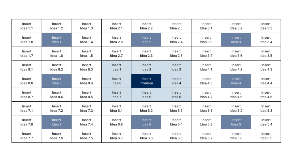
Example template for a How-How diagram
Step 1: State the Problem
Begin by clearly defining the primary problem or need. Write this on a card or Post-It Note and place it on the left side of your workspace. Ensure that the problem is framed as a need to facilitate the “How?” question.
Step 2: Ask “How can this be done?”
Generate initial solutions by asking, “How can this be done?” Write each solution on a separate card and place them to the right of the problem statement.
Step 3: Identify Relationships
Some solutions may be alternatives, while others might need to occur together. Indicate these relationships by writing “and” or “or” between the cards.
Step 4: Repeat the Process
For each solution generated, ask “How?” again to break it down further. Continue this process, building a hierarchy of increasingly specific actions.
Step 5: Review and Refine
Once you’ve exhausted all possibilities, review the diagram. You may choose to draw connecting lines between related items, but it’s often best to leave this until the end to allow for easy rearrangement of cards.
Applying How-How Diagrams in CAPA Development
In CAPA processes, How-How Diagrams can be invaluable for:
Root Cause Analysis: Break down potential causes of issues to identify the true root cause.
Action Planning: Develop detailed, step-by-step corrective and preventive actions.
Implementation Strategy: Map out the specific steps needed to implement CAPA solutions effectively.
Enhancing Risk Management with How-How Diagrams
Risk management can benefit from How-How Diagrams in several ways:
Risk Identification: Systematically explore potential risks by asking “How could this go wrong?”
Mitigation Planning: Develop comprehensive risk mitigation strategies by breaking down each risk into manageable actions.
Contingency Planning: Create detailed contingency plans for identified risks.
Streamlining Change Control with How-How Diagrams
In change control processes, How-How Diagrams can:
Impact Analysis: Thoroughly explore the potential impacts of proposed changes.
Implementation Planning: Break down the change process into specific, actionable steps.
Communication Strategy: Develop a clear plan for communicating changes to all stakeholders.
Best Practices for Using How-How Diagrams
To maximize the effectiveness of How-How Diagrams:
Encourage Participation: Involve diverse team members to gain multiple perspectives.
Stay Focused: Keep the discussion centered on the main problem or goal.
Be Specific: Aim for concrete, actionable solutions rather than vague ideas.
Prioritize: Once the diagram is complete, identify the most critical or impactful actions.
Document: Capture the final diagram and use it as a reference for implementation and follow-up.
Conclusion
The How-How Diagram is a versatile and powerful tool for problem-solving by providing a structured approach to breaking down complex issues. It enables teams to develop comprehensive, actionable plans. Whether you’re addressing quality issues, managing risks, or implementing changes, the How-How Diagram can help you navigate the process with clarity and precision.
In the world of creative problem-solving and idea generation, the Lotus Blossom technique stands out as a powerful and structured approach to brainstorming. Developed by Yasuo Matsumura, a Japanese management consultant, this method combines the free-flowing nature of traditional brainstorming with a systematic framework that encourages deeper exploration of ideas.
How It Works
The Lotus Blossom technique uses a visual diagram resembling a lotus flower, hence its name. Here’s a step-by-step breakdown of the process:
Start with a central idea or problem in the middle of a 3×3 grid.
Surround the central concept with eight related ideas or themes.
Take each of these eight ideas and make them the center of their own 3×3 grids.
Generate eight new ideas for each of these secondary grids.
Repeat the process until you have a fully bloomed “lotus” of ideas.
By the end of this process, you’ll have generated up to 64 ideas stemming from your original concept.
Benefits of the Lotus Blossom Technique
Structured Creativity: Unlike traditional brainstorming, which can sometimes feel chaotic, the Lotus Blossom method provides a clear structure for idea generation.
Depth and Breadth: This technique encourages both broad thinking and deep exploration of specific themes.
Visual Organization: The diagram format helps visualize connections between ideas and keeps the brainstorming process organized.
Flexibility: It can be used individually or in small groups, making it versatile for various settings.
Tips for Success
To make the most of the Lotus Blossom technique, consider these tips:
Embrace All Ideas: Don’t self-censor. Even seemingly unrelated or far-fetched ideas can spark innovation.
Time Management: Set time limits for each phase to maintain momentum and prevent overthinking.
Iterate and Refine: After completing the diagram, review and refine your ideas. Look for patterns or combinations that might lead to breakthrough solutions.
I think it can be a really valuable exercise to consider, and align on semantic meaning of words, even words that may seem to everyone to mean one particular thing, and triage is a great example of that. When we spend time agonizing over words in documents, arguing about glossaries, what we are doing is aligning over semantic usage for terms that may have drifted a lot.
And don’t even get started on cultural appropriation of words.
The technical nature of our work means that semantic change, which is already a natural and inevitable process in language evolution, is going to happen. Words that we regularly use acquire new meanings or shift in their usage over time. Look what we’ve done to the poor word leverage or pipeline for just to examples.
Like data, we need word stewards, the keeper of the glossary. This role is in service to the process owners to enforce them agreeing on terms and using them the same way as possible. This is why I strongly believe in central glossaries. The dangers of not doing this can be impaired communication, with the message being lost or misinterpreted. And that leads to inefficiencies, and errors, and history has shown us those errors can get pretty significant.
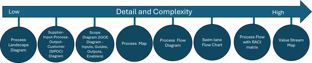
In the last two posts (here and here) I’ve been talking about how process mapping is a valuable set of techniques to create a visual representation of the processes within an organization. Fundamental tools, every quality professional should be fluent in them.
The next level of maturity is process modeling which involves creating a digital representation of a process that can be analyzed, simulated, and optimized. Way more comprehensive, and frankly, very very hard to do and maintain.
Process Map
Process Model
Why is this Important?
Notation ambiguous
Standardized notation convention
Standardized notation conventions for process modeling, such as Business Process Model and Notation (BPMN), drive clarity, consistency, communication and process improvements.
Precision usually lacking
As precise as needed
Precision drives model accuracy and effectiveness. Too often process maps are all over the place.
Icons (representing process components made up or loosely defined
Icons are objectively defined and standardized
The use of common modeling conventions ensures that all process creators represent models consistently, regardless of who in the organization created them.
Relationship of icons portrayed visually
Icon relationships definite and explained in annotations, process model glossary, and process narratives
Reducing ambiguity, improving standardization and easing knowledge transfer are the whole goal here. And frankly, the average process map can fall really short.
Limited to portrayal of simple ideas
Can depict appropriate complexity
We need to strive to represent complex workflows in a visually comprehensible manner, striking a balance between detail and clarity. The ability to have scalable detail cannot be undersold.
One-time snapshot
Can grow, evolve, mature
How many times have you sat down to a project and started fresh with a process map? Enough said.
May be created with simple drawing tools
Created with a tool appropriate to the need
The right tool for the right job
Difficult to use for the simplest manual simulations
May provide manual or automated process simulation
In w world of more and more automation, being able to do a good process simulation is critical.
Difficult to link with related diagram or map
Vertical and horizontal linking, showing relationships among processes and different process levels
Processes don’t stand along, they are interconnected in a variety of ways. Being able to move up and down in detail and across the process family is great for diagnosing problems.
Uses simple file storage with no inherent relationships
Uses a repository of related models within a BPM system
It is fairly common to do process maps and keep them separate, maybe in an SOP, but more often in a dozen different, unconnected places, making it difficult to put your hands on it. Process modeling maturity moves us towards a library approach, with drives knowledge management.
Appropriate for quick capture of ideas
Appropriate for any level of process capture, analysis and design
Processes are living and breathing, our tools should take that into account.
This is all about moving to a process repository and away from a document mindset. I think it is a great shame that the eQMS players don’t consider this part of their core mission. This is because most quality units don’t see this as part of their core mission. We as quality leaders should be seeing process management as critical for future success. This is all about profound knowledge and utilizing it to drive true improvements.
A process flow diagram is a visual representation of the steps in a process, showing the sequence of activities from start to finish. Using simple shapes and arrows, it maps out how work flows through your system, highlighting decision points, inputs, outputs, and the relationships between different steps. When most people think process map they really mean process flow.
When to Use Process Flow Diagrams
Process flow diagrams shine in various scenarios:
Analyzing existing processes: They help identify inefficiencies, bottlenecks, and redundancies in current workflows.
Designing new processes: When creating new procedures, flow diagrams provide a clear blueprint for implementation.
Training and onboarding: They serve as excellent visual aids for explaining processes to new team members.
Continuous improvement initiatives: Flow diagrams facilitate discussions about potential enhancements and streamlining opportunities.
Compliance and auditing: They offer a standardized way to document processes for regulatory purposes.
Creating Effective Process Flow Diagrams
To make the most of your diagrams:
Start with the big picture: Begin by outlining the major steps before diving into details.
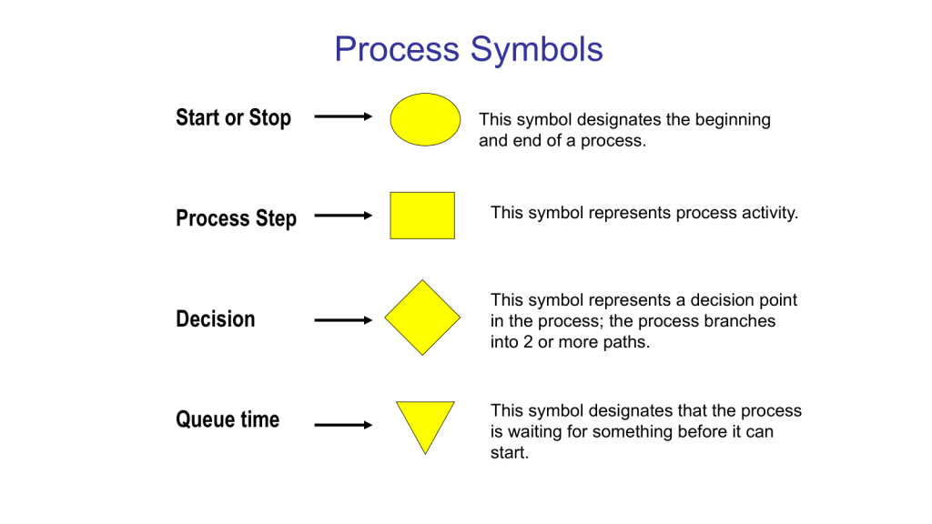
Use standard symbols: Stick to commonly recognized shapes (e.g., rectangles for activities, diamonds for decisions) to ensure clarity.
Keep it simple: Avoid cluttering your diagram with too much information. Focus on the key steps and decision points.
Involve the right people: Collaborate with those who actually perform the process to ensure accuracy.
Review and refine: Regularly update your diagrams as processes evolve.
Benefits of Using Process Flow Diagrams
Process flow diagrams are truly one of the core quality tools. With them we can:
Improve communication: They provide a common visual language for discussing processes across teams.
Enhance efficiency: By clearly mapping out steps, you can more easily identify areas for optimization.
Better decision-making: Flow diagrams help managers understand the implications of process changes.
Increase standardization: They promote consistency in how tasks are performed across the organization.
Process flow diagrams are more than just pretty pictures – they’re powerful tools for understanding, improving, and communicating about your business processes. By incorporating them into your workflow analysis and design efforts, you’ll be taking a significant step towards operational excellence.
This is the level of process mapping that usually sits at the heart of the SOP.
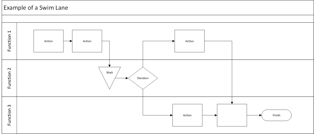
Swim-Lane Flowchart
A swim lane flowchart, also known as a swim lane diagram or cross-functional flowchart, is a visual representation of a process that separates activities into distinct lanes. Each lane typically represents a different department, team, or individual responsible for a set of actions within the process.
Key Benefits of Swim Lane Flowcharts
Clear Responsibility Assignment: By dividing the process into lanes, it’s immediately clear which team or individual is responsible for each step.
Improved Communication: These diagrams provide a common visual language for discussing processes across departments.
Identify Handoffs and Bottlenecks: Easily spot where work passes between teams and where delays might occur.
Process Optimization: Visualizing the entire process helps identify redundancies and opportunities for streamlining.
Onboarding and Training: New team members can quickly grasp complex processes and their role within them.
Creating an Effective Swim Lane Flowchart
To make the most of this tool:
Define the Process Scope: Clearly identify the start and end points of the process you’re mapping.
Identify Participants: Determine which departments or roles will have their own lanes.
Map the Process: Use standard flowchart symbols to represent steps, decisions, and document flows.
Show Handoffs: Clearly indicate where work passes from one lane to another.
Review and Refine: Collaborate with stakeholders to ensure accuracy and identify improvement opportunities.
Data Maps are an example of a swim lane flow chart.
Here’s a blog post on process flow with RACI matrix:
Mastering Process Management: Combining Process Flow with RACI Matrix
This tool merges two powerful tools stand out for their ability to clarify complex workflows: the process flow diagram and the RACI matrix. When combined, these tools create a comprehensive view of not just how a process unfolds, but also who’s involved at each step. Let’s dive into this dynamic duo and explore how they can revolutionize your process management.
Process Flow Diagram: This visual representation maps out the sequence of steps in a process, showing how work progresses from start to finish.
RACI Matrix: This responsibility assignment chart clarifies the roles people play in each process step:
Responsible: Who does the work?
Accountable: Who makes the final decisions?
Consulted: Who provides input?
Informed: Who needs to be kept in the loop?
When you combine a process flow with a RACI matrix, you create a comprehensive view of your process that answers two critical questions:
What happens in the process?
Who’s involved at each step?
This integration strives to provide clarity of roles. It becomes immediately clear who’s responsible for each step, reducing confusion and improving accountability. Team members can easily see where they fit into the larger process and who they need to interact with. This should hopefully help balance resources and streamline decision-making. It is a great tool for training.
Creating Your Integrated Diagram
To build your process flow with RACI matrix:
Start with Your Process Flow: Map out the steps of your process using standard flowchart symbols.
Add RACI Information: For each step, indicate the R, A, C, and I roles. This can be done through color-coding, symbols, or additional columns next to each step.
Review and Refine: Collaborate with stakeholders to ensure the diagram accurately reflects both the process and the roles involved.
Use It: Implement the diagram in your operations, referring to it for training, process improvement, and day-to-day management.
Integrating process flows with RACI matrices creates a powerful tool for process management. It not only shows how work gets done but also clarifies who’s involved every step of the way. This comprehensive view can lead to more efficient operations, clearer communication, and ultimately, better business outcomes.
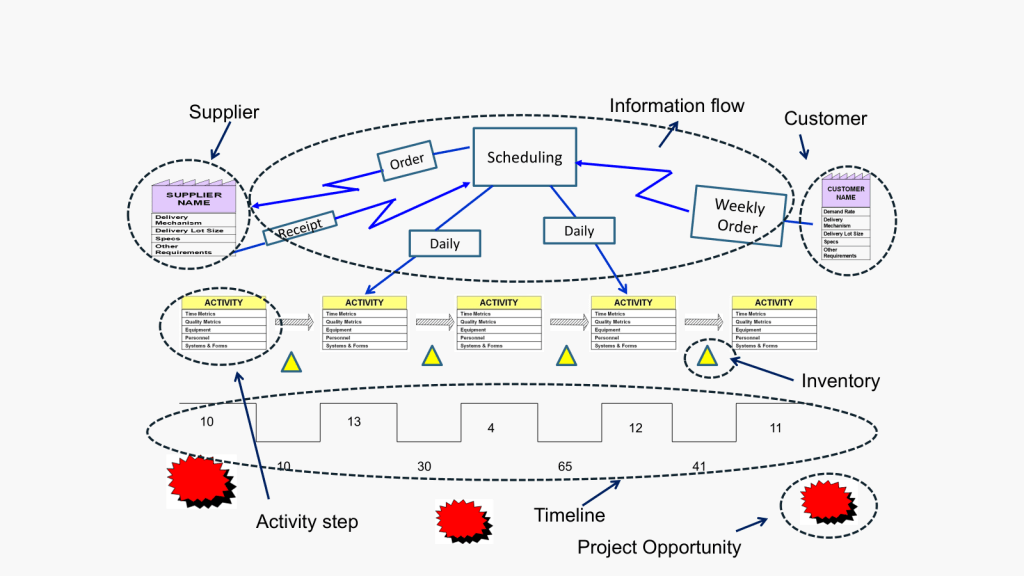
Value Stream Map
Value Stream Mapping (CSM) is a process mapping technique used to analyze, design, and manage the flow of materials and information required to bring a product or service to a customer. It is a visual representation of every step in your process, from the initial order to the final delivery of the product or service.
Coming out of Lean and organization excellence the value stream map is all about identifying waste: VSM helps you spot non-value-adding activities in your processes, allowing you to eliminate them and improve efficiency.
How to Create a Value Stream Map
Create a Current State Map: Document your process as it currently exists, including material and information flows.
Analyze the Current State: Identify areas of waste and inefficiency in your current process.
Design a Future State Map: Envision an improved process that eliminates the identified waste.
Implement Changes: Develop and execute a plan to move from the current state to the future state.
Review and Iterate: Continuously monitor your new process and make further improvements as needed.
Best Practices for Value Stream Mapping
Involve Cross-Functional Teams: Ensure representatives from all relevant departments participate in the mapping process.
Focus on the Customer: Always keep the end customer’s needs in mind when analyzing and improving your processes.
Use Standard Symbols: Adopt a consistent set of symbols to represent different elements of your value stream.
Walk the Process: Physically follow the flow of materials and information to gain a firsthand understanding of your processes.
Measure Key Metrics: Collect data on important metrics like cycle time, lead time, and inventory levels to quantify improvements.