Process Mapping as a Scaling Solution (part 1)

I love a good process map in all it’s permutations. It is important to remember that the various process mapping tools are on a scale on order of detail and complexity.
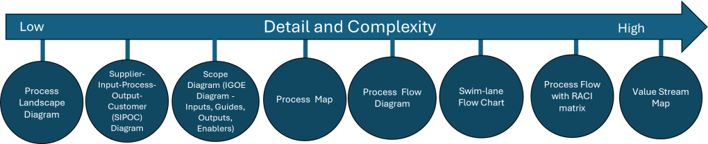
Tool NameDescription
Process Landscape DiagramA Process Landscape Diagram is a visual representation that outlines the structure and interdependencies of processes within an organization, providing insight into how these processes work together to achieve strategic goals. This tool helps in understanding process flows and managing business operations more effectively by illustrating connections and hierarchies among various processes.
SIPOCSIPOC is a visual representation tool for documenting a business process from beginning to end. It provides a high-level overview by summarizing the key components of Suppliers, Inputs, Processes, Outputs, and Customers.
Scope Diagram (IGOE Diagram)
The Scope Diagram, also known as the IGOE Diagram, is used to define and agree on the boundaries of a process, enhancing communication among stakeholders. This diagram illustrates the scope of a project at a high abstraction level and helps identify candidate processes for change. It focuses on the Inputs, Guides, Outputs, and Enablers of a business process, facilitating better understanding and management of the scope by clarifying process boundaries without detailing internal system features.
Process MapA Process Map is a visual tool used to represent the flow of work and the steps involved in a business process. This tool helps teams understand, analyze, and improve workflows by detailing the processes involved, making it easier to identify inefficiencies and areas for improvement. Process maps are often utilized in project management and continuous improvement efforts to enhance productivity and streamline operations.
Process Flow DiagramA Process Flow Diagram (PFD) is a diagram commonly used to indicate the general flow of plant processes and equipment. It visualizes the sequential steps and relationships between components in a process, aiming to improve project planning and identify inefficiencies.
Swim-lane Flow ChartA Swim-lane Flow Chart, also known as a cross-functional diagram, is a type of flowchart that shows the workflow and responsibilities in a process. It visually segments tasks into lanes that clarify who is responsible for each step, making it easier to understand complex processes and identify inefficiencies or redundancies.
Process Flow with RACI matrixThe RACI matrix is a project management tool that clarifies roles and responsibilities of team members by categorizing them into four groups: Responsible, Accountable, Consulted, and Informed. This structure aids in ensuring effective communication and workflow management across various stages of a project, helping teams stay aligned and avoiding confusion.
Process Mapping Tools

Process Landscape Diagram

A process landscape diagram is a high-level visual representation of an organization’s business processes and their relationships. Process landscape diagrams provide a comprehensive overview of an organization’s processes at a macro level and define the scope and relationships between an organization’s business processes. This serves as a simple way to handle process-related communication and serves as a starting point for detailed process discovery.

The process landscape diagram represents processes as ‘black-boxes’, focusing on interrelationships rather than internal details. Thus it shows the structure, grouping, modularity, functionality, and technology of chain processes, business processes, and working processes. Ideally this should include connections to external participants or stakeholders.

Components and Structure

A typical process landscape diagram may include:

  • Core processes (value chain or end-to-end processes)
  • Management processes
  • Support processes
  • Relationships and dependencies between processes
  • Connections to external participants or stakeholders

When to do

The process landscape diagram is design to enable organizations to maintain an overview of processes which makes this an excellent centerpiece to your Quality Manual.

ICH Q10 actually has a nice process landscape in it.

SIPOC

I’ve written about SIPOC’s in the past.

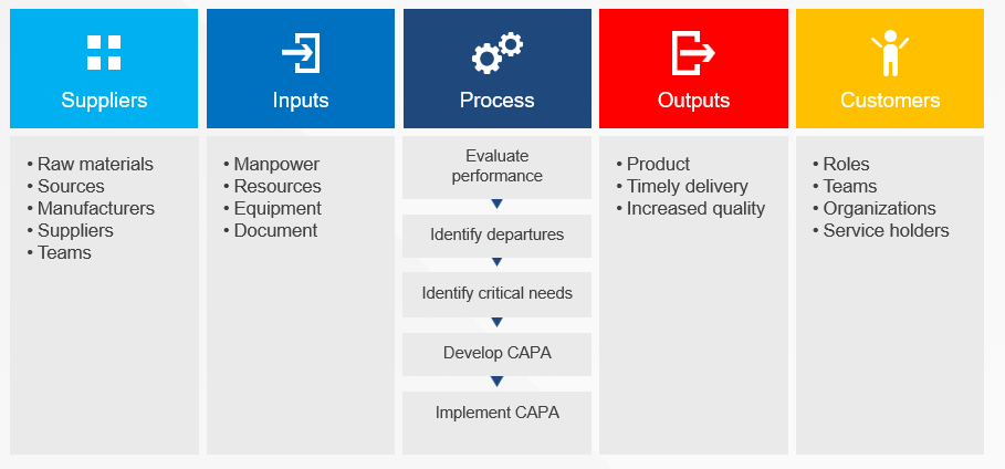
SIPOC diagrams are powerful tools in process improvement and management, offering numerous advantages that make them invaluable in various scenarios. These diagrams provide a high-level overview of a process, enabling teams to grasp the big picture quickly and efficiently. By facilitating clear communication and collaboration among team members and stakeholders, SIPOC diagrams help break down silos and foster a shared understanding of complex processes. This clarity often leads to the identification of improvement opportunities and potential problem areas that might otherwise go unnoticed.

One of the key strengths of SIPOC diagrams lies in their versatility. They serve as excellent tools for defining and scoping complex projects, helping teams to set clear boundaries and objectives from the outset. Additionally, these diagrams aid in understanding customer requirements and managing supplier relationships, two critical aspects of any business process. SIPOC diagrams also prove invaluable as training tools for new employees, offering a concise yet comprehensive overview of how a process functions within the larger organizational context.

The use of SIPOC diagrams is particularly beneficial when embarking on new process improvement projects or redesigning existing processes by providing a structured approach to understanding the current state and envisioning future improvements. They’re also extremely useful in situations where the scope of a project is unclear or poorly defined, helping to bring clarity and focus to the team’s efforts.

SIPOC diagrams excel in fostering cross-functional collaboration. By providing a common language and visual representation of a process, they facilitate discussions and decision-making among different departments or stakeholders. This makes them particularly valuable in problem-solving initiatives and when ensuring compliance with regulations and standards. SIPOC diagrams also serve as effective tools for supplier evaluation and performance assessment, helping organizations maintain strong relationships with their supply chain partners.

SIPOC diagrams are most effective when there’s a need to quickly visualize and understand a process without delving into excessive detail. They help teams focus on the essential elements of a process and provide a solid foundation for more in-depth analysis and improvement efforts. Whether used in the early stages of a project, for ongoing process management, or as part of continuous improvement initiatives, SIPOC diagrams offer a simple yet powerful way to enhance understanding, communication, and efficiency across an organization.

I love a SIPOC in a program level document.

Scope Diagram (IGOE Diagram)

IGOE stands for Inputs-Guides-Outputs-Enablers, the basic components of any business process. This model is used to define the scope of a process with an initial, high-level overview of the process in-scope and the problems associated with that process and the relationships between the process-in-scope, upstream or downstream processes, relevant documents, stakeholders etc.

Scope Diagram- IGOE
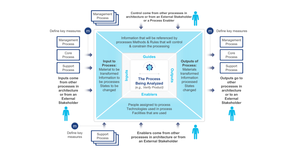
  • Input is defined as something that is transformed or consumed, input can be information, materials, people
  • Guide is defined as anything that describes the when, why, or how a process or activity occurs, guides can be policies, strategies, regulations, law
  • Outputs are the product or result of the change that occurs to the Inputs or the result of the creation of something based on the Guides, outputs can be results, deliverables, products, information, people
  • Enablers are the resources or assets required to transform an Input into an Output or to create Outputs, enablers can be systems, equipment, tools, assets, facilities, human resources

These diagrams are particularly useful at the outset of a process improvement project, serving as a powerful means to define and agree upon the boundaries of a process. By clearly illustrating the process scope and interactions, IGOE diagrams play a crucial role in setting the right expectations among project stakeholders and establishing a solid foundation for the improvement effort.

One of the key strengths of IGOE diagrams lies in their ability to measure the reach of a process. By explicitly showing how the business interacts with external entities, these diagrams provide a systematic way to assess impact. This can really help identify stakeholders in a project.

Process owners and subject matter experts often turn to IGOE diagrams for high-level root cause analysis. This application allows them to conduct a relatively accurate assessment to determine the focus and scope of an improvement project.

Scope diagrams excel in enhancing communication with various stakeholders. Their intuitive nature and lack of technical jargon make them accessible to a wide audience, facilitating better understanding and alignment among team members and stakeholders. This clarity in communication is particularly beneficial when defining vision and building consensus.

Another significant advantage of scope diagrams is their ability to illustrate process dependencies. By providing a clear picture of the factors that shape processes, these diagrams create a better understanding of potential future process iterations. This insight is invaluable during task prioritization, as the additional information about importance and impact can guide strategic decision-making in the project.

Scope diagrams are most effective in communicating a comprehensive understanding of a process’s scope, boundaries, and interactions with its environment. Whether used at the beginning of an improvement initiative, for aligning stakeholders on process scope and impact, or as a precursor to more detailed process analysis, IGOE diagrams offer a structured and insightful approach to process understanding and improvement planning.

This is a tool we don’t use enough.

Process Map

Process maps are powerful visual tools that provide a clear and comprehensive representation of workflows or processes within an organization. These diagrams illustrate the sequence of steps, activities, and decisions involved in completing a task or achieving a specific outcome. By offering a visual overview of how a process works from start to finish, process maps serve multiple purposes, including identifying inefficiencies and bottlenecks, facilitating communication among team members and stakeholders, and serving as valuable training resources for new employees.

The versatility of process maps makes them indispensable in various business scenarios. At the outset of process improvement projects, these visual aids help teams gain a thorough understanding of the current state of a process before embarking on optimization or redesign efforts. They are particularly useful when defining project scope, as they assist in setting clear boundaries and expectations for process improvement initiatives. For complex processes, maps break down intricate workflows into more manageable, understandable steps, making them easier to analyze and improve.

Process maps excel as communication tools, proving invaluable during team brainstorming sessions by providing a visual aid for discussing and analyzing processes. They also serve as effective training resources for new hires, offering a clear, step-by-step guide to understanding roles and responsibilities within the organization. When documenting standard operating procedures, process maps complement written instructions, enhancing clarity and comprehension.

In problem-solving scenarios, process maps are instrumental in identifying the root causes of issues within a workflow. They allow teams to examine each step of a process for efficiency and effectiveness during process analysis, leading to more targeted improvements. Furthermore, process maps provide a concise way to explain processes to stakeholders who may not be directly involved in day-to-day operations, fostering better understanding and alignment across the organization.

When implementing new systems or technologies, process maps help identify how these tools will impact existing workflows, facilitating smoother transitions and integration. This makes them particularly valuable in organizations focused on continuous improvement, quality management, and operational efficiency.

Process maps are versatile tools that can be employed whenever there’s a need to understand, analyze, improve, or communicate about a process. Their visual nature makes complex information more accessible, promoting better decision-making and more effective process management. Whether used in small-scale departmental improvements or large-scale organizational transformations, process maps remain a fundamental tool in the arsenal of business process management and continuous improvement methodologies.

In my next post in this series I will start with Business Process Notation as a methodology for process mapping.

PDCA and OODA

PDCA (and it’s variants) are a pretty tried and true model for process improvement. In the PDCA model a plan is structured in four steps: P (plan) D (do) C (check) A (act). The intention is create a structured cycle that allows the process to flow in accordance with the objectives to be achieved (P), execute what was planned (D), check whether the objectives were achieved with emphasis on the verification of what went right and what went wrong (C) and identify factors of success or failure to feed a new process of planning (A).

Conceptually, the organization will be a fast turning wheel of endlessly learning from mistakes and seeking to maximize processes in order to remain forever in pursuit of strategic objectives, endlessly searching for the maximum efficiency and effectiveness of the system.

The OODA Loop

The OODA loop or cycle was designed by John R. Boyd and consists of a cycle of four phases:
Observe, Orient, Decide and Act (OODA).

  • Observe: Based on implicit guidance and control, observations are made regarding unfolding circumstances, outside information, and dynamic interaction with the environment (including the result of prior actions).
  • Orient: Observations from the prior stage are deconstructed into separate component
    pieces; then synthesized and analyzed in several contexts such as cultural traditions, genetic
    heritage, and previous experiences; and then combined together for the purposes of
    analysis and synthesis to inform the next phase.
  • Decide: In this phase, hypotheses are evaluated, and a decision is made.
  • Act: Based on the decision from the prior stage, action is taken to achieve a desired effect
    or result

While similar to the PDCA improvement of a known system making it more effective, efficient or effective (depending on the effect to be expected), the OODA strives to model a framework for situational awareness.

Boyd’s concentration on the specific set of circumstances relevant to military situations had for years meant the OODA loop has not received a lot of wide spread interest. I’ve been seeing a lot of recent adaptations of the OODA loop try to expand to address the needs of operating in volatile, uncertain, complex and ambiguous (VUCA) situations. I especially like seeing it as part of resilience and business continuity.

Enhanced Decision-Making Speed and Agility

    The OODA loop enables organizations to make faster, more informed decisions in rapidly changing environments. By continuously cycling through the observe-orient-decide-act process, organizations can respond more quickly to market crises, threats, and emerging opportunities.

    Improved Situational Awareness

      The observation and orientation phases help organizations maintain a comprehensive understanding of their operating environment. This enhanced situational awareness allows us to identify trends, threats, and opportunities more effectively.

      Better Adaptability to Change

        The iterative nature of the OODA loop promotes continuous learning and adaptation. This fosters a culture of flexibility and responsiveness, enabling organizations to adjust their strategies and operations as circumstances evolve.

        Enhanced Crisis Management

          In high-pressure situations or crises, the OODA loop provides a structured approach for rapid, effective decision-making. This can be invaluable for managing unexpected challenges or emergencies.

          Improved Team Coordination and Communication

            The OODA process encourages clear communication and coordination among team members as they move through each phase. This can lead to better team cohesion and more effective execution of strategies.

            Data-Driven Culture

              The OODA loop emphasizes the importance of observation and orientation based on current data. This promotes a data-driven culture where decisions are made based on real-time information rather than outdated assumptions.

              Continuous Improvement

                The cyclical nature of the OODA loop supports ongoing refinement of processes and strategies. Each iteration provides feedback that can be used to improve future observations, orientations, decisions, and actions.

                Complementary Perspectives

                PDCA is typically used for long-term, systematic improvement projects, while OODA is better suited for rapid decision-making in dynamic environments. Using both allows organizations to address both strategic and tactical needs.

                Integration Points

                1. Observation and Planning
                  • OODA’s “Observe” step can feed into PDCA’s “Plan” phase by providing real-time situational awareness.
                  • PDCA’s structured planning can enhance OODA’s orientation process.
                2. Execution
                  • PDCA’s “Do” phase can incorporate OODA loops for quick adjustments during implementation.
                  • OODA’s “Act” step can trigger a new PDCA cycle for more comprehensive improvements.
                3. Evaluation
                  • PDCA’s “Check” phase can use OODA’s observation techniques for more thorough assessment.
                  • OODA’s rapid decision-making can inform PDCA’s “Act” phase for faster course corrections.

                The White Paper in the Quality System

                Eventually there will be a thorny topic that needs to be teased out, directed at an audience beyond those involved. This isn’t quite a technical report, or a risk assessment or a program document. It is that chameleon, the white paper.

                A white paper can play several important roles in a quality management system:

                1. Establish standards and best practices: White papers can outline recommended procedures, methodologies, and standards for quality within an organization or industry. They can provide detailed guidance on implementing quality processes.
                2. Educating stakeholders: White papers serve as educational tools to inform employees, management, and other stakeholders about quality principles, new technologies, or approaches to improving quality. They help build a shared understanding of quality objectives.
                3. Problem-solving: White papers often follow a problem-solution structure, identifying quality issues and proposing detailed solutions backed by research and data. This can help organizations address specific quality challenges.
                4. Documenting processes: As part of a quality management system, white papers can provide in-depth documentation of complex processes, procedures, or systems. This documentation is crucial for consistency and compliance.
                5. Promoting continuous improvement: By presenting research findings and innovative approaches, white papers can drive continuous improvement efforts in quality management.
                6. Supporting decision-making: The authoritative and data-driven nature of white papers makes them valuable resources for informed decision-making about quality initiatives.
                7. Demonstrating expertise: For organizations, publishing white papers on quality topics can establish thought leadership and demonstrate expertise to clients, partners, and regulatory bodies.
                8. Compliance support: In regulated industries, white papers can help explain how an organization’s quality system meets regulatory requirements or industry standards.
                9. Change management: When implementing new quality processes or technologies, white papers can help communicate the rationale and benefits to stakeholders, supporting change management efforts.
                10. Benchmarking: White papers often include industry data and best practices, allowing organizations to benchmark their quality performance against peers or industry standards.

                White Papers and Standards

                A standard in a quality system is a documented set of requirements, specifications, or guidelines that define the criteria for quality in processes, products, or services. They offer precise descriptions that serve as an objective basis for organizations and consumers to communicate and conduct business globally. Standards provide organizations with shared procedures, terminology, and expectations to meet stakeholder requirements.

                A white paper usually defines what will end up being in a standard, or defends the decision making of the standard. It is a why document.

                White Papers and the Program Level

                The program is a document that maps requirements to show the various ways to interpret the requirements to specific needs. Program documents, like a validation master plan or contamination control strategy, define the strategic plan that tie the entire program into a pretty package. A white paper then provides more in-depth justification of the rationale.

                White Papers are Outward Orientated

                When we write a white paper we are usually taking all the decision making a team made and the rationale behind them. It is a place to draw together all those articles and consensus standards we utilized, all the internal technical studies and risk management. White papers are written often aimed for health authorities, auditors, clients and partners.

                How to Write a White Paper

                Clear goals and target audience

                A well-defined purpose is crucial for any white paper. Ask yourself:

                • What do you want to achieve with this document?
                • Who is your primary audience? Common ones are health authorities, clients, other parts of the organization.
                • What action do you want readers to take after reading? Usually it answers questions, but other times there is a translation necessary (e.g. update SOPs)

                Concise summary

                The executive summary or abstract should:

                • Be no more than 200-250 words
                • Highlight the main problem, solution, and key takeaways
                • Entice the reader to delve into the full document

                Strong introduction

                A compelling introduction should:

                • Provide context for the topic
                • Establish the relevance and importance of the issue
                • Outline the structure of the paper
                • Hook the reader with an interesting fact, statistic, or scenario

                Problem statement

                When defining the problem:

                • Use data and real-world examples to illustrate its scope and impact
                • Explain why existing solutions were inadequate
                • Highlight the consequences of not addressing the issue

                Well-researched content

                To ensure credibility:

                • Use a mix of primary and secondary sources
                • Link to requirements and obligations (i.e. regulatory regulations, consensus standards, industry best practices)
                • Include recent data
                • Reference industry reports and academic studies
                • Conduct original research and risk management as appropriate

                Solution(s)

                When presenting solutions:

                • Explain the rationale behind each option
                • Discuss pros and cons objectively
                • Provide evidence of effectiveness, such as case studies or pilot results
                • Clearly state why the recommended or chosen solution is superior

                Logical flow and structure

                Organize your content with:

                • A clear, logical progression of ideas
                • Subheadings and sections for easy navigation
                • Transitional phrases between sections
                • A balance of text, visuals, and white space

                Visual elements

                Effective visuals can include:

                • Infographics summarizing key data
                • Process diagrams explaining complex concepts
                • Comparison charts for different solutions
                • Relevant photographs or illustrations

                Conclusion and call-to-action

                A strong conclusion will:

                • Recap the main points without introducing new information
                • Reinforce the urgency of addressing the problem
                • Provide clear, actionable next steps for the reader, as appropriate
                • Include contact information or resources for further engagement

                References

                Properly cite sources by:

                • Using a consistent citation style (e.g., APA, MLA)
                • Including a bibliography or reference list at the end
                • Using footnotes or endnotes for additional context if necessary

                Objective tone

                Maintain credibility by:

                • Using a professional, authoritative voice
                • Avoiding overly promotional language
                • Acknowledging potential limitations or challenges
                • Presenting a balanced view of the topic

                Hierarchical Task Analysis

                Hierarchical Task Analysis (HTA) is a structured method for understanding and analyzing users’ tasks and goals within a system, product, or service. A technique of task decomposition, it visibly breaks down complex tasks into smaller, more manageable parts.

                Key Concepts

                1. Goal-Oriented: HTA starts with identifying the main goal or objective of the task. This goal is then broken down into sub-goals and further into smaller tasks, creating a hierarchical structure resembling a tree.
                2. Hierarchical Structure: The analysis is organized hierarchically, with each level representing a task broken down into more detailed steps. The top level contains the main goal, and subsequent levels contain sub-tasks necessary to achieve that goal.
                3. Iterative Process: HTA is often an iterative process involving multiple rounds of refinement to ensure that all tasks and sub-tasks are accurately captured and organized.

                Steps to Conduct HTA

                1. Preparation and Research: Gather information about the system, including user needs, tasks, pain points, and other relevant data. This step involves understanding the target audience and observing how the task or system is used in real-world scenarios.
                2. Define the Use Case: Identify the scope of the analysis and the specific use case to be mapped. This includes understanding what needs to be mapped, why it is being mapped, and which user segment will engage with the experience.
                3. Construct the Initial Flow Chart: Create an initial draft of the flow chart that includes all the steps needed to complete the task. Highlight interactions between different parts of the system.
                4. Develop the Diagram: Break the main task into smaller chunks and organize them into a task sequence. Each chunk should have a unique identifier for easy reference.
                5. Review the Diagram: Validate the diagram’s accuracy and completeness through walkthroughs with stakeholders and users. Gather feedback to refine the analysis.
                6. Report Findings and Recommendations: Identify opportunities for improvement and make recommendations based on the analysis. This step involves further user research and ideation, culminating in a report to share with team members and stakeholders.

                Applications of HTA

                • UX Design: HTA helps UX designers understand user interactions and identify pain points, leading to improved user experiences.
                • Human Factors Engineering: Originally used to evaluate and improve human performance, HTA is effective in designing systems that align with human capabilities and limitations.
                • Training and Onboarding: HTA can create training materials and onboarding processes by breaking down complex tasks into manageable steps.
                • Process Improvement: By analyzing and visualizing tasks, HTA helps identify inefficiencies and areas for improvement in existing systems.

                Benefits of HTA

                • Comprehensive Understanding: A detailed view of all steps involved in completing a task.
                • Identifies Opportunities for Improvement: Helps pinpoint critical steps, redundant tasks, and user struggles.
                • Facilitates Communication: Offers a clear and structured way to share findings with stakeholders.
                • Supports Complex Task Analysis: Handles detailed and complex tasks effectively, making it suitable for various applications.

                Limitations of HTA

                • Not Suitable for All Tasks: HTA is less effective for tasks that are open, volatile, uncertain, complex, and ambiguous (e.g., emergency response, strategic planning).
                • Requires Iterative Refinement: The process can be time-consuming and may require multiple iterations to achieve accuracy.

                Hierarchical Task Analysis for Computer System Validation (CSV)

                As an example, we will create an HTA for a Computer System Validation (CSV) process through release. Not meant to be exhaustive but meant to illustrate the point.

                1. Planning and Preparation

                1.1 Develop a Validation Plan

                • Create a comprehensive validation plan outlining objectives, scope, and responsibilities.
                • Include timelines, resource allocation, and project management strategies.

                1.2 Conduct Risk Assessment

                • Perform a risk assessment to identify potential risks and their impact on validation.
                • Document mitigation strategies for identified risks.

                1.3 Define User Requirements

                • Gather and document User Requirements Specifications (URS).
                • Ensure that the URS aligns with regulatory requirements and business needs.

                2. System Design and Configuration

                2.1 Develop System Configuration Specifications (SCS)

                • Document the hardware and software configuration needed to support the system.
                • Ensure that the configuration meets the defined URS.

                2.2 Installation Qualification (IQ)

                • Verify that the system is installed correctly according to the SCS.
                • Document the installation process and obtain objective evidence.

                3. Testing and Verification

                3.1 Operational Qualification (OQ)

                • Test the system to ensure it operates according to the URS.
                • Document test results and obtain objective evidence of system performance.

                3.2 Performance Qualification (PQ)

                • Conduct performance tests to verify that the system performs consistently under real-world conditions (includes disaster recovery)
                • Document test results and obtain objective evidence.

                4. User Readiness

                4.1 Write Procedure

                • Create process and procedure to execute within the system
                • Create Training

                4.2 Perform User Acceptance Testing

                • Confirmation business process meets requirements
                • Document test results and iteratively improve on process and training

                5. Documentation and Reporting

                5.1 Create Traceability Matrix

                • Develop a traceability matrix linking requirements to test case.
                • Ensure all requirements have been tested and verified.

                5.2 Validation Summary Report

                • Compile a validation summary report detailing the validation process, test results, and any deviations.
                • Obtain approval from stakeholders.

                Prioritization: MoSCoW, Binary and Pairwise

                Prioritization tools are essential for effective decision-making. They help teams decide where to focus their efforts, ensuring that the most critical tasks are completed first.

                MoSCoW Prioritization

                The MoSCoW method is a widely used prioritization technique in project management, particularly within agile frameworks. It categorizes tasks or requirements into four distinct categories:

                • Must Have: Essential requirements that are critical for the project’s success. Without these, the project is considered a failure.
                • Should Have: Important but not critical requirements. These can be deferred if necessary but should be included if possible.
                • Could Have: Desirable but not necessary requirements. These are nice-to-haves that can be included if time and resources permit.
                • Won’t Have: Requirements agreed to be excluded from the current project scope. These might be considered for future phases.

                Advantages:

                • Clarity and Focus: Clearly distinguish between essential and non-essential requirements, helping teams focus on what truly matters.
                • Stakeholder Alignment: Facilitates discussions and alignment among stakeholders regarding priorities.
                • Flexibility: Can be adapted to various project types and industries.

                Disadvantages:

                • Ambiguity: May not provide clear guidance on prioritizing within each category.
                • Subjectivity: Decisions can be influenced by stakeholder biases or political considerations.
                • Resource Allocation: Requires careful allocation of resources to ensure that “Must Have” items are prioritized appropriately.

                Binary Prioritization

                Binary prioritization, often implemented using a binary search tree, is a method for systematically comparing and ranking requirements. Each requirement is compared against others, creating a hierarchical list of priorities.

                Process:

                1. Root Node: Start with one requirement as the root node.
                2. Comparison: Compare each succeeding requirement to the root node, establishing child nodes based on priority.
                3. Hierarchy: Continue creating a long list of prioritized requirements, forming a binary tree structure.

                Advantages:

                • Systematic Approach: Provides a clear, structured way to compare and rank requirements.
                • Granularity: Offers detailed prioritization, ensuring that each requirement is evaluated against others.
                • Objectivity: Reduces subjectivity by using a consistent comparison method.

                Disadvantages:

                • Complexity: Can be complex and time-consuming, especially for large projects with many requirements.
                • Resource Intensive: Requires significant effort to compare each requirement systematically.
                • Scalability: It may become unwieldy with many requirements, making it difficult to manage.

                Pairwise Comparison

                Pairwise or paired comparison is a method for prioritizing and ranking multiple options by comparing them in pairs. This technique is particularly useful when quantitative, objective data is not available, and decisions need to be made based on subjective criteria.

                How Pairwise Comparison Works

                1. Define Criteria: Establish clear criteria for evaluation, such as cost, strategic importance, urgency, resource allocation, or alignment with objectives.
                2. Create a Matrix: List all the items to be compared along its rows and columns. Each cell in the matrix represents a comparison between two items.
                3. Make Comparisons: For each pair of items, decide which item is more important or preferred based on the established criteria. Mark the preferred item in the corresponding cell of the matrix.
                4. Calculate Scores: After all comparisons are made, count the times each item was preferred. The item with the highest count is ranked highest in priority.

                Benefits of Pairwise Comparison

                • Simplicity: It is easy to understand and implement, requiring no special training[3].
                • Objectivity: Reduces bias and emotional influence in decision-making by focusing on direct comparisons.
                • Clarity: Provides a clear ranking of options, making it easier to prioritize tasks or decisions.
                • Engagement: Encourages collaborative discussions among team members, leading to a better understanding of different perspectives.

                Limitations of Pairwise Comparison

                • Scalability: The number of comparisons increases significantly with the number of items, making it less practical for large lists.
                • Relative Importance: Does not allow for measuring the intensity of preferences, only the relative ranking.
                • Cognitive Load: Can be mentally taxing if the list of items is long or the criteria are complex.

                Applications of Pairwise Comparison

                • Project Management: Prioritizing project tasks or deliverables.
                • Product Development: Ranking features or requirements based on customer needs.
                • Survey Research: Understanding preferences and establishing relative rankings in surveys.
                • Strategic Decision-Making: Informing decisions by comparing strategic options or initiatives.

                Example of Pairwise Comparison

                Imagine a project team needs to prioritize seven project deliverables labeled A to G. They create a pairwise comparison matrix and compare each deliverable against the others. For instance, deliverable A is compared to B, then A to C, and so on. The team marks the preferred deliverable in each comparison. After completing all comparisons, they count the number of times each deliverable was preferred to determine the final ranking.

                Comparison of MoSCoW Prioritization, Binary Prioritization, and Pairwise Comparison

                Here’s a detailed comparison of the three prioritization methods in a tabular format:

                AspectMoSCoW PrioritizationBinary PrioritizationPairwise Comparison
                Key AspectsCategorizes tasks into Must, Should, Could, and Won’t haveCompares requirements in pairs to create a hierarchical listCompares options in pairs to determine relative preferences
                AdvantagesSimple to understand, clear categorization, stakeholder alignmentSystematic approach, detailed prioritization, reduces subjectivityIntuitive, suitable for long lists, provides numerical results
                DisadvantagesSubjective categorization, may oversimplify complex projectsTime-consuming for large projects, may become complexCan be cognitively difficult, potential for inconsistency (transitivity violations)
                ClarityHigh-level categorizationDetailed prioritization within a hierarchyProvides clear ranking based on direct comparisons
                Stakeholder InvolvementHigh involvement and alignment requiredLess direct involvement, more systematicEncourages collaborative discussions, but can be intensive
                FlexibilityAdaptable to various projectsBest suited for projects with clear requirementsSuitable for both small and large lists, but can be complex for very large sets
                ComplexitySimple to understand and implementMore complex and time-consumingCan be cognitively taxing, especially for large numbers of comparisons
                Resource AllocationRequires careful planningSystematic but resource-intensiveRequires significant effort for large sets of comparisons

                Conclusion

                Each prioritization method has its own strengths and weaknesses, making them suitable for different contexts:

                • MoSCoW Prioritization is ideal for projects needing clear, high-level categorization and strong stakeholder alignment. It is simple and effective for initial prioritization but may lack the granularity needed for more complex projects.
                • Binary Prioritization offers a systematic and detailed approach, reducing subjectivity. However, it can be time-consuming and complex, especially for large projects.
                • Pairwise Comparison is intuitive and provides clear numerical results, making it suitable for long lists of options. It encourages collaborative decision-making but can be cognitively challenging and may lead to inconsistencies if not carefully managed.

                Choosing the right method depends on the specific needs and context of the decision, including the number of items to prioritize, the level of detail required, and the involvement of stakeholders.