My fellow PowerPoint jockies, we have been outdone by ROCHE LIMIT, a surrealist point and click horror adventure that was created (and is played in) Microsoft PowerPoint.
The current build of ROCHE LIMIT takes around 20 minutes to play through and features one of the multiple planned endings to the full game. The actual narrative is quite Lynchian and appears to revolve around you accepting your (and possibly the human race’s) inevitable demise and a higher power’s ambivalence towards it. It’s a fun, quick little game, with excellent audio design and pixel art animation throughout.
Our PowerPoint presentations have a new standard, and that standard is this wild little game.
For a lot of reasons paper (and paper-on-glass) documents are with us for a long time. So it continually surprises me when I see documents in some basic, reduced readability font .
Even when we go to electronic systems that choice of font is going to be an important one. And it’s probably not the same font as what worked for you in a paper world.
And then there is all that training material and presentations (including conference material).
So spend some time and choose the fonts that works for you and your users. But please for goodness sake don’t default to a font because it is what you have always used.
With the current plan to start attending conferences again this spring, I’ve been working a lot on a few different presentations, which means spending a lot of time on PowerPoint presentations.
Microsoft debuted PowerPoint in 1987, and since then, it has been used to present content in meetings, conference rooms, and classrooms. There are a lot of jokes about how bad PowerPoint can be, but if you know a little about its features, PowerPoint can be so much more than mere presentation software. It can be the means for taking audiences on a truly engaging learning adventure as well as a powerful tool that supports presenters by serving as their digital co-facilitator. It just requires some work.
Making presentations for folks outside my organization always gets me thinking of best practices. It helps me concentrate on how the true value of PowerPoint isn’t to serve as an information provider—that’s the role of a presenter. The true value of PowerPoint is to support you and your presentation.
A presentation is most effective when it is focused and has a coherent narrative. Achieving that starts with defining your objectives and then taking some time to figure out how you’ll meet those objectives. Be intentional in your use of PowerPoint.
Traditional PowerPoint Thinking
Intentional PowerPoint Design Thinking
Every presentation needs slides.
My intended presentation outcomes should dictate the types of visual aids I use (or don’t use).
Every point I make needs a slide.
My slides should never compete with me for the audience’s attention; they should support my message.
PowerPoint is synonymous with your presentation.
PowerPoint is my co-facilitator.
PowerPoint is linear, and slides appear sequentially.
Using triggers and hyperlinks, it’s possible to reveal information dynamically.
Templates make a slide deck look professional.
Effective use of slide real estate and visual representation of my message looks professional.
There is a maximum number of words and an ideal font size for most presentations.
My audience should be able to read all the words that appear on a slide.
People need a lot of information on technical slides and data-driven presentations.
Slides are a visual aid for a presentation; more detailed information is better offered through handouts.
There are lots of options for animations and transitions, so they should all be used at some point.
Animations and transitions can help focus attention, but there is such a thing as too much.
I can send someone my PowerPoint deck and that should be the equivalent of attending my presentation.
Most narratives can be placed in the Notes section and distributed, along with my slides, to paint a complete picture for those not in attendance.
What’s Possible with PowerPoint?
Give a lot of thought to who is your audience. It is always a good idea to understand your audience, but when speaking to folks outside of your What (if anything) does the potential audience already know about your topic? What should the audience be able to do new, different, or better because of the time spent with you?
For example, at the upcoming ISPE Asceptic Conference, my audience understands pharmaceutical quality systems so I can start with the understanding that they understand the basics of my topic. My presentation, as a result, can go to more advanced topics and not have to explain the basics.
A presentation is most effective when it is focused and has a coherent narrative. Achieving that starts with defining your objectives and then taking some time to figure out how you’ll meet those objectives. Taking an hour or two to map out your thoughts and truly think through how best to visually represent your key points can help ensure that your presentation will be tight and focused with a coherent flow.
For each slide:
Slide Purpose/Objective
Sketch/Imagery
Key Points
Things Conferences Should Change
Working on presentations for conferences again really reminds me of all the bad practices conferences continue to use.
Stop Using Templates: It is a common misconception is that using a template makes the slide deck look more professional. Slide templates do help with consistency, but they dramatically reduce the real estate you have to work with on your slide. By the very nature of their structure, these templates encourage a title and bulleted list format. Don’t just believe me, watch this fun video by Will Thalheimer. The more space on a slide that is occupied by professional-looking template designs and logos, the less space remains for inserting powerful imagery, text, facts, or figures.
Leverage Technology to Break Linearity: Most people use PowerPoint in linerar ways, and conference technology builds pretty much make that an inevitability. The technology exists to allow the audience to have some sort of control over the content that’s on display in front of them, and would greatly enhance the conference experience.
Resources
Bozarth, J. 2013. Better Than Bullet Points: Creating Engaging e-Learning with PowerPoint. 2nd ed. San Francisco: John Wiley & Sons.
Duarte, N. 2010. Resonate: Present Visual Stories that Transform Audiences. Hoboken, NJ: John Wiley & Sons.
Duarte, N. 2008. slide:ology: The Art and Science of Creating Great Presentations. Sebastopol, CA: O’Reilly Media.
Medina, J. 2014. Brain Rules (2nd ed.). Seattle: Pear Press.
Schwertly, S. 2011. How to be a Presentation God: Build, Design and Deliver Presentations that Dominate. Hoboken, NJ: John Wiley & Sons.
Vella, J. 2002. Learning to Listen, Learning to Teach: The Power of Dialogue in Educating Adults. San Francisco: Jossey-Bass.
Williams, R. 2008. The Non-Designer’s Design Book. 3rd ed. Berkeley, CA: Peachpit Press.
This book does an amazing job of giving you the tools of transforming a boring management review into a compelling narrative. Following the step-by-step recommendations will give you a blueprint for effective telling the story of your organizations quality maturity and help you execute into action.
For example, this table is the start of an amazing section about crafting a narrative that then goes into an amazing discussion on structuring a slide presentation to get this done.
Argumentative Writing (Logical Approach)
Persuasive Writing (Emotional Appeal)
Writing a Recommendation (Blend of Both)
Purpose
Construct compelling evidence that your viewpoint is backed by the truth and is factual
Persuade the audience to agree with your perspective and take action on your viewpoint
Use the data available, plus intuition, to form a point of view that requires action from your organization
Approach
Deliver information from both sides of the issue by choosing one side as valid and causing others to doubt the counterclaim
Deliver information and opinions on only one side of the issue, and develop a strong connection with a target audience
Develop a story supported by evidence ad also include any counterarguments your audience may have, so tat they feel you have considered their perspective
Appeals
Use logical appears to support claims with solid examples, expert opinions, data, and facts. The goal is to be right, not necessarily take action
Use emotional appeals to convince others of your opinion and feelings, so the audience will move forward on your perspective
Structure the appeal as a story, support your recommendation with data and solid evidence that sticks by adding meaning
Tone
Professional, tactful, logical
Personal, passionate, emotional
Appropriate tone based on the audience
Another great takeaway is when Nancy presents results of her extensive analysis on word patterns in speeches, right down to the choice of effective verbs, conjunctions, adjectives, adverbs, interjections, and rhetorical questions. The choice of “process or performance verbs” is connected to whether the recommended course of action is continuity, change or termination.
This is a book that keeps giving.
I found it so invaluable that I bought a copy for everyone on my team.
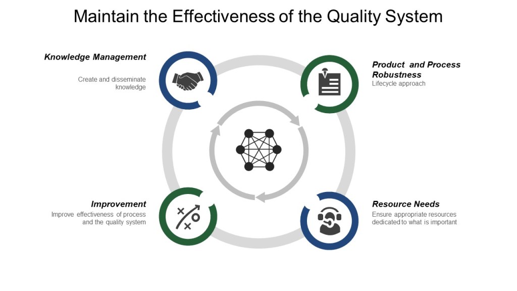
ISO9001:2015 states “Top management shall review the organization’s quality management system, at planned intervals, to ensure its continuing suitability, adequacy, effectiveness and alignment with the strategic direction of the organization.”
Management review takes inputs of system performance and converts it to outputs that drive improvement.
Just about every standard and guidance aligns with the ISO9001:2015 structure.
The Use of PowerPoint in Management Review
Everyone makes fun of PowerPoint, and yet it is still with us. As a mechanism for formal communication it is the go-to form, and I do not believe that will change anytime soon.
One of the best pieces of research on PowerPoint and management review is Kaplan’s examination of PowerPoint slides used in a manufacturing firm. Kaplan found that generating slides was “embedded in the discursive practices of strategic knowledge production” and made up “part of the epistemic machinery that undergirds the know-ledge production culture.” Further, “the affordances of PowerPoint,” Kaplan pointed out, “enabled the difficult task of collaborating to negotiate meaning in an uncertain environment, creating spaces for discussion, making recombinations possible, [and] allowing for adjustments as ideas evolved”. She concluded that PowerPoint slide decks should be regarded not as merely effective or ineffective reports but rather as an essential part of strategic decision making.
Kaplan’s findings are not isolated, there is a broad wealth of relevant research in the fields of genre and composition studies as well as research on material objects that draw similar conclusions. Powerpoint, as a method of formal communication, can be effective.
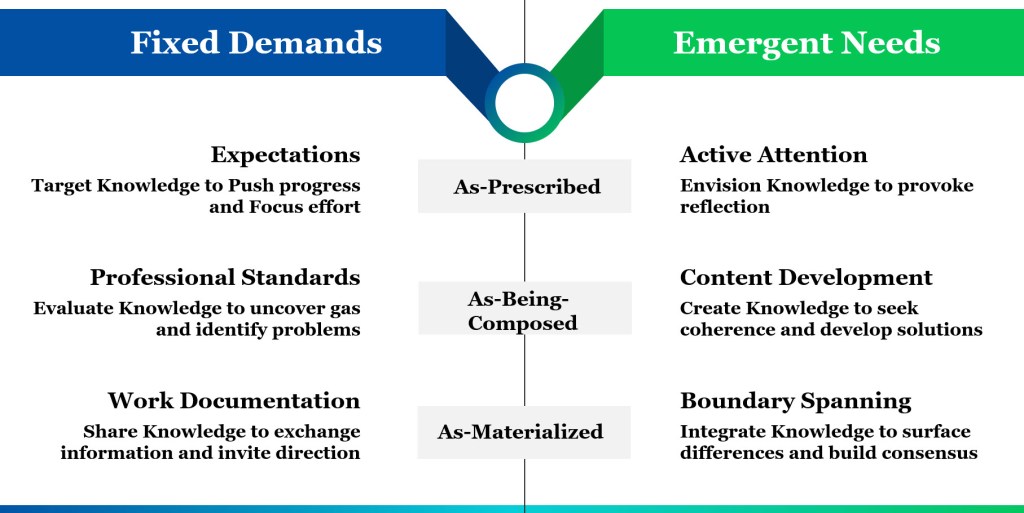
Management Review as Formal Communication
Management review is a formal communication and by understanding how these formal communications participate in the fixed and emergent conditions of knowledge work as prescribed, being-composed, and materialized-texts-in-use, we can understand how to better structure our knowledge sharing.
Management review mediates between Work-As-Imagined and Work-As-Done.
The quality management reviews have “fixity” and bring a reliable structure to the knowledge-work process by specifying what needs to become known and by when, forming a step-by-step learning process.
As-Being-Composed
Quality management always starts with a plan for activities, but in the process of providing analysis through management review, the organization learns much more about the topic, discovers new ideas, and uncover inconsistencies in our thinking that cause us to step back, refine, and sometimes radically change our plan. By engaging in the writing of these presentations we make the tacit knowledge explicit.
A successful management review imagines the audience who needs the information, asks questions, raises objections, and brings to the presentation a body of experience and a perspective that differs from that of the party line. Management review should be a process of dialogue that draws inferences and constructs relationships between ideas, apply logic to build complex arguments, reformulate ideas, reflects on what is already known, and comes to understand the material in a new way.
As-Materialized
Management review is a textually mediated conversation that enables knowledge integration within and across groups in, and outside of, the organization. The records of management review are focal points around which users can discuss what they have learned, discover diverse understandings, and depersonalize debate. Management review records drive the process of incorporating the different domain specific knowledge of various decision makers and experts into some form of systemic group knowledge and applies that knowledge to decision making and action.
Sources
Alvesson, M. (2004). Knowledge work and knowledge-intensive firms. Oxford University Press.
Bazerman, C. (2003). What is not institutionally visible does not count: The problem of making activity assessable, accountable, and plannable. In C. Bazerman & D. Russell (Eds.), Writing selves/writing societies: Research from activity perspectives (pp. 428–482). WAC Clearinghouse
Edmondson, A. C. (2012). Teaming: How organizations learn, innovate, and compete in the knowledge economy. Jossey-Bass
Kaplan, S. (2015). Strategy and PowerPoint: An inquiry into the epistemic culture and machinery of strategy making. Organization Science, 22, 320–346.
Levitin, D. J. (2014). The organized mind: Thinking straight in the age of information overload. Penguin
Mengis, J. (2007). Integrating knowledge through communication: The case of experts and decision makers. In Proceedings of the 2007 International Conference on Organizational Knowledge, Learning, and Capabilities (pp. 699–720). OLKC. Retrieved from https://warwick.ac.uk/fac/soc/wbs/conf/olkc/archive/olkc2/papers/mengis.pdf